Applied Arts Magazine
2011—print
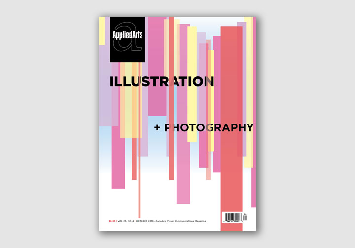
Applied Arts held a Canada wide student contest to redesign their magazine, this is my submission. My goal was the create a vibrant and graphic reading experience while maintaining space for the reader to easily and simply read large articles.
I used the typefaces Gotham for headings, and Cartier for the body text, there are bits of Berthold City and Proforma scattered throughout the display text. This project only existed as a digital file.


The body text is set in Cartier, a particularly Canadian typeface.

There was quite a variety of content to work with, one of the challenges of this project was to keep it interesting while not straying too far from a visual language.

