Class in Type
2010—print
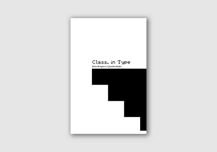
This project was an exercise in typesetting under strict constraints for legibility and production. We were asked to choose two essays under the topic of typographic classification and set them in an appropriate manner. I chose to use two very different typefaces in order to contrast and draw attention to two very different types of type.
The body text was set in Hoefler Text for legibility and the headings were set in Earthbound Zero. The final books were printed by the Digital Output Center at Emily Carr University.


Hierarchy was very important for this book so as to maintain a good reading flow.


